HOW TO BEGIN DESIGNING WONDERLAND
I didn’t consciously go into nursery design mode, I just happened upon it at some point during the four years of trying to make a baby to put in one, and with most great visual ideas, it was a mindless instagram scroll.
TRAWL INSTAGRAM (BUT MINDLESSLY)
This is where I really recommend beginning; You will naturally be served accounts that you like to engage with, and what with Instagram being a visual platform, most of the time it is because you like what you’re looking at.
#NurseryInspo doesn’t have to come from a mum blogger account, or an interiors one or a dedicated nursery one, it can be anything. Here is how mine went:
I was somehow following someone who I now can’t find for the life of me - typical eh? But her account was an eclectic crazy mix of banging colours and stuff in her home. It wasn’t an interiors aesthetic I aspired to, but the pics were lovely, vibrant , so cluttered and crowded they were almost alive. Which I liked.
She’d posted a makeover of her daughters bedroom and it was all pink and rattan and this humongous floral mural on one wall. Like the perfect little girl wonderland, I thought, so I saved it absentmindedly.
The concept of nursery wonderland was stuck with me from then, and the mural was the focal point. After all of our struggles we’re pretty sure M will be an only child, and with that in mind I wanted her room to be one she could grow with, that would spike her imagination, that she’d just love to be in, and so it needed character. A lot of character.
GO INTO A RESEARCH RABBIT HOLE
Pin, pin, pin some more, see where your pins take you, work out that this pink bedroom mural came from that amazing site Surface View (you have to love Surface View), spend hours trawling that, do some more pinning, realise you love the pink one because that stuck in your head and almost order it. Almost, but something was stopping me. I didn’t want it to be so gender biased, and I didn’t want an exact copy of some unknown bedroom I’d seen once, because that wouldn’t feel as exciting.
THINK OF A THEME
I wanted ‘magical wonderland’. Easy! Simple! Lol. I decided on a total wall covering scene that she could get lost in, maybe remember forever, just a little thing. More internet digging took me to Rebel Walls, an absolutely incredible Swedish company with hundreds of awe-inspiring design options. There’s a whole post on it here.
THINK OF THE FUTURE
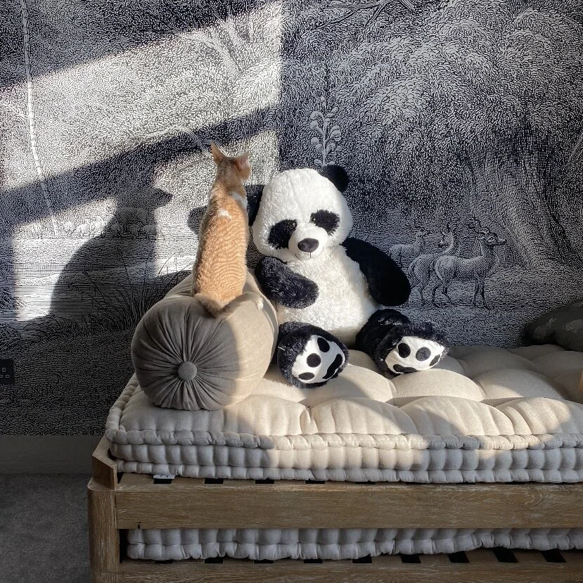
The black and white design I chose had a full colour option which is stunning, but I thought I might find it a bit overwhelming, a bit too thematic and maybe baby-like for longevity. Also black and white is baby sensory heaven. The simplicity of the monotone makes the pattern more beautiful than crazy, which makes it work for me and the baby.
ACCESSORISE ALL AREAS
What is more magical than some giant characters dotted around the room to make friend with? I had this giant panda toy waiting for the baby for, ooh, five years at least, and I loved the thought of it being so much bigger than her, how amazing must that be from her POV. So I got a couple more giants to add to her crew, a whale from excellent french brand BigStuffed, and an XL corduroy Miffy, because Miffy is ESSENTIAL
ADD COLOUR
As much as babies love black and white, it’s a bit stark, maybe even clinical on its own. I love fluro accents to bounce your eyes off, and anything magical-rainbow toned. But not too much. It’s about going subtle, but going bold. A felt garland or a colourful mobile will add focus that the baby won’t be able to take their eyes off either.
MOODBOARD
It’s great to get all the ideas down before you start investing. I had a clear idea of the theme so I could build around it, but it would’ve been so easy to go overboard with shopping as delightful as this. Pin a board or save some tabs and when you see it all come together you’ll adore it all the more. And seeing your baby adore it is heaven. (Actually it’s magical wonderland)


